Experimenting with an opinionated design language for AI-generated apps
Written by Ben Graves, Product Designer
AI is fundamentally reshaping how software is designed, built, and maintained. As we increasingly rely on non-deterministic agents, a critical question emerges: how do we ensure quality, coherence, and long-term supportability? How do we harness the full power of large language models, their ability to reason, solve problems, and generate complex systems, while still producing software that is reliable, maintainable, and predictable in practice? This tension sits at the heart of what we do at Cogna.
Cogna was founded in 2023 to build an AI platform for critical industries, taking customers from problem exploration to deployed, supported software.
1. The problem - our apps didn’t feel “designed”
As we began generating apps with AI, we ran into issues that may feel familiar to anyone experimenting with AI-driven development.
- Inconsistent UI/UX - Similar workflows produced different patterns, layouts, and behaviours. Even apps for the same customer didn’t feel like they came from the same product universe. We wanted Cogna apps to feel intentional and opinionated, not like a random walk through possible UI patterns.
- Pattern duplication - Many apps solved similar workflow problems on similar data, yet the platform kept rebuilding variations of the same patterns. That meant duplicated code, duplicated interaction logic, and unnecessary maintenance overhead.
- Implicit intent - The intended app behaviour wasn’t explicitly captured in relation to the UI. You could see screens and components, but not clearly how a user was meant to move through the app or complete a task.
By summer 2024, this was clearly costing us time, effort, and customer experience.
2. The constraints - scaling without designers in the loop
Our delivery model pairs the platform with two human roles. Solution Strategists work directly with customers to understand the problem and define the workflow. App Delivery Engineers keep a human in the loop as the platform builds, deploys and supports each application.
We initially explored whether we could up-skill these roles to handle more of the UI/UX design, leaning on a designer when they got stuck or needed extra review. In practice, this pulled them into a level of interface detail that wasn’t where we wanted their expertise. When designers were brought in, we noticed we were leaning on the same underlying patterns to solve similar problems. That raised a question: should those decisions really be made repeatedly at a project level?
So we set ourselves a constraint: assume we do not have a designer shaping every app. If Cogna apps were going to feel intentional and consistent, the platform would need to enable good interface design by default.
3. The opportunity - working within a defined space
At Cogna, we differentiate ourselves from other tools in a specific way: taking customers from problem exploration to deployed, supported SaaS.
Many AI tools cover parts of the lifecycle. You might generate a UI in one place, code in another, and handle deployment elsewhere. It’s powerful, but you’re still stitching the pieces together and carrying the operational risk.
We don’t expect that from our customers. We own the full cycle.
The trade-off is scope. We operate within a constrained software space: structured, workflow-driven, web-based SaaS with AI capabilities. We’re not trying to generate arbitrary software, like air traffic control systems or 3D console games.
That constraint is deliberate.
It does not limit the value we can deliver to customers. The problems we solve and the outcomes we enable sit comfortably within this space. Instead, it limits the range of software patterns the system needs to support.
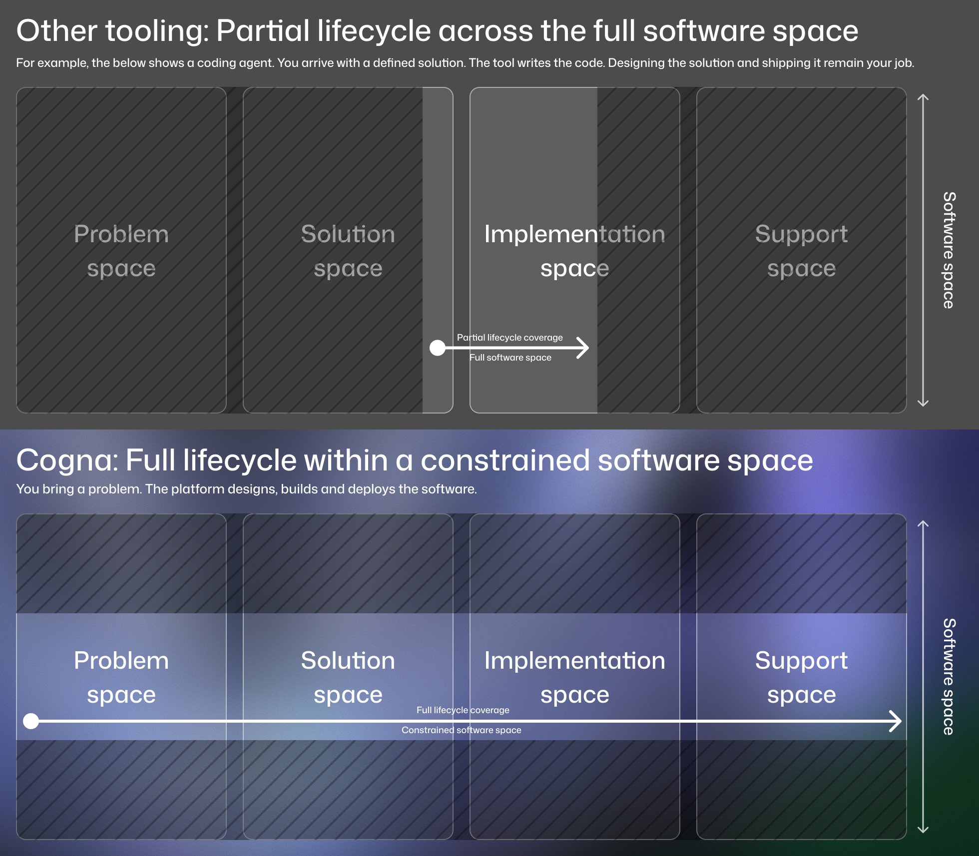
That constraint creates an opportunity.
Because we operate within a constrained software space and control the lifecycle end to end, we can be selective about structure and behaviour, narrowing the design possibilities our system needs to support.
4. The goalposts - defining what “designed” means
Before jumping to ideation, we needed to define what “designed” actually meant in our context.
What does software that’s been looked after by designers actually feel like? We defined a baseline set of criteria:
- Simple and familiar: Apps should use standard, well-understood patterns. Familiarity narrows the design space and improves usability.
- Consistent and reusable: Patterns and interaction models should repeat across apps. Reuse creates familiarity for users and reduces duplication in code, though never at the cost of the right solution for the user.
- Guided and focused: Custom software should feel tailored to the domain, not like configuring a general-purpose, customisable tool. The structure of the app should guide the task, make the next step obvious, and remove unnecessary options.
- Responsive by default: Modern SaaS is expected to work across devices. Mobile usability should be built in.
- Accessible by default: Accessibility should not be solved per app. It should be embedded in the system and adhere to web standards.
5. The exploration - how do we define and encode good design?
Learning from design systems
Large product organisations use design systems to solve a coordination problem. Many teams, many contributors, many surfaces. Without shared rules and components, decisions drift and inconsistency compounds.
A design system encodes decisions. It turns “what good looks like” into reusable components and principles so teams don’t have to reinvent design choices every time they ship.
It doesn’t remove judgement, but it narrows the space of valid decisions.
That felt relevant to us.
We didn’t have dozens of design teams. We had dozens of apps being shaped by Large Language Models (LLMs). Without constraint, each one could interpret “good UI” differently. That makes it very hard to achieve the kind of opinionated, coherent product experience we wanted.
The problem with an LLM is it’s actually seen EVERYTHING and it doesn’t really have an opinion. Or it confuses itself thinking people like purple gradients everywhere… Ryo Lu (Head of Design, Cursor): AI Turns Designers to Developers The a16z Show Podcast
One of our advisors drew an unexpected parallel in platform design.
When Apple introduced Vision Pro, they were introducing an entirely new interaction paradigm, one that neither users nor developers had any familiarity with. Rather than leaving the design space open, they constrained it deliberately. Apps are built within a small set of structured presentation types provided by the platform, keeping the experience consistent and easing adoption from day one.
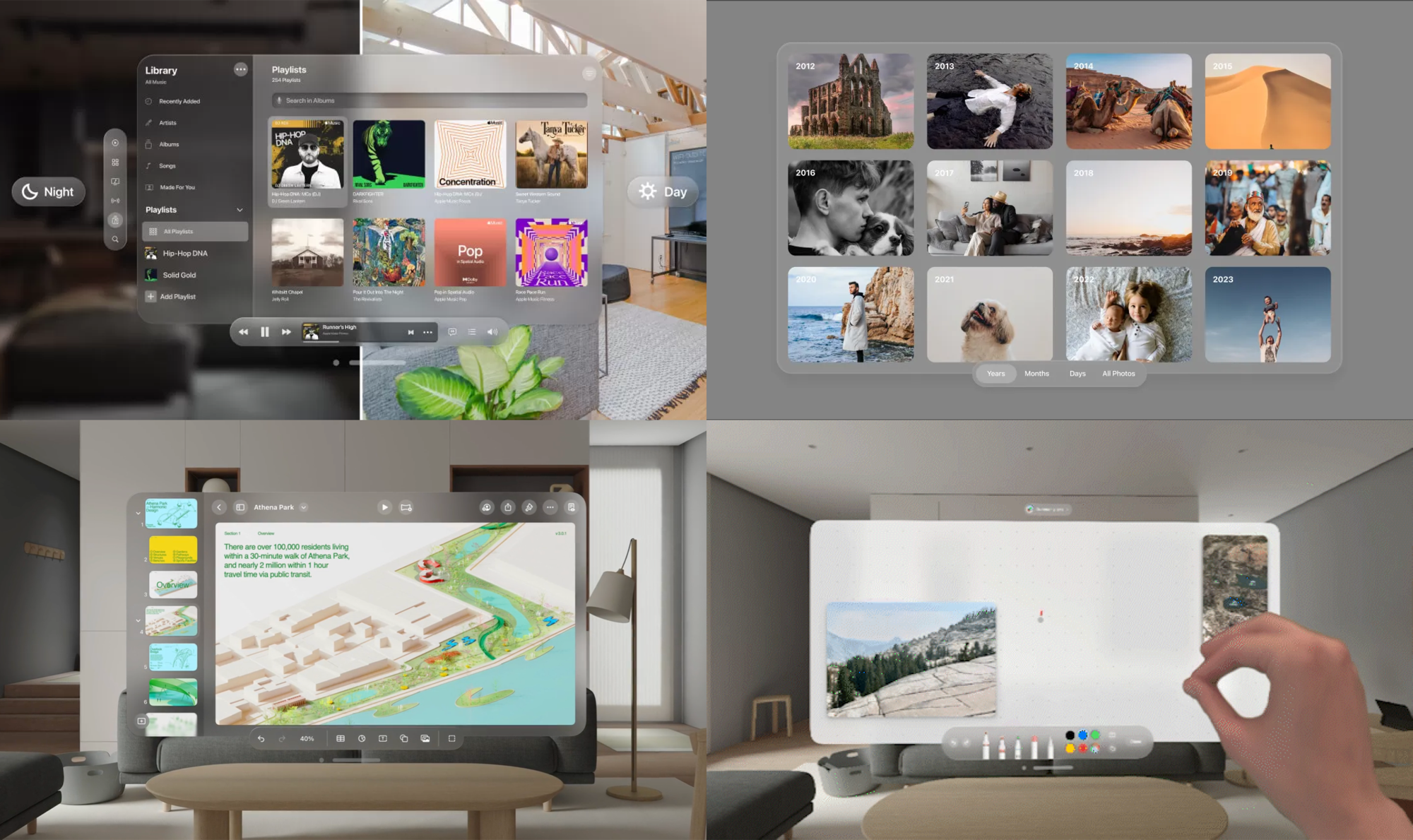
Core panels and interaction patterns are implemented once and reused across apps.
That constraint benefits both sides. Users get consistency. Developers inherit robustness.
Cogna web applications aren’t a new paradigm like spatial computing. For our critical industry customers, though, this way of working often is. If these apps are going to become part of daily workflows, they need to feel consistent and easy to adopt.
From design language to DSL
As we worked through the design language, engineering brought another angle: domain-specific languages (DSLs) as a way to constrain LLM generation and introduce a clearer abstraction above raw application code. A DSL could make structure explicit and improve maintainability.
The conversation between the two threads led to a question:
Could we encode app intent in a design language, express it as an LLM-friendly DSL, and render it into UI using a design system?
6. The hypotheses - encoding intent, rendering UI
Hypothesis 1 - encode app intent in a constrained language
Within our defined slice of software, we believed we could create an intuitive design language that captures intended app behaviour.
“Intuitive” mattered.
It had to use concepts Solution Strategists and users already reason with: workflows, entities, actions, decisions, outcomes, not layout systems or component variants. Additionally, it needed to be familiar enough that LLMs could reason about it and write into it.
If successful, intent would be explicit and inspectable, rather than implied by scattered screens.
Hypothesis 2 - map the language deterministically to UI
The second hypothesis felt like the bigger bet.
In a constrained SaaS space, we believed the mapping from structured intent to interface could be largely deterministic.
SaaS patterns repeat: lists, forms, detail views, action buttons. If the language described workflow structure and data clearly enough, an opinionated set of UI rules could render a coherent interface. No extra LLM loop. No manual UI/UX layer. Just high level configuration. At the time, we equated “opinionated” with deterministic, because the design reasoning was encoded in the system.
If this worked, the payoff was meaningful:
- Users stay in their domain, describing and validating the process.
- Consistency becomes structural because the same structure renders the same way.
- Duplication reduces because patterns are implemented once and reused.
Effectively, UI design could emerge from reasoning about the data and process, rather than designing the interface directly.
7. The experiment - How might we formalise the abstraction?
We set out to define what this language might look like. It needed to operate at a higher level of abstraction than UI design itself, using concepts simple enough to constrain the design space beneath them.
In practice, we realised that designers already work this way. We don’t discuss component variants, state transitions, or layout systems with stakeholders. We discuss flow, data structures and affordances.
To ground this in our context, we redesigned several existing apps in Figma and looked for repeated abstractions. How were we distilling complex interfaces into concepts stakeholders could reason about?
A simple model emerged.
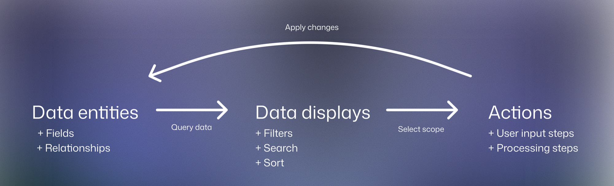
- Data entities - Every app revolves around domain entities: orders, approvals, assets, cases. These are the nouns of the business. They define the shape, relationships, and constraints of the domain.
- Displays - Users inspect and navigate entities through lists, tables, detail views, and summaries. These are the views of the system, answering questions like what exists, what needs attention, or what happened. A display represents a specific query over entities and supports a user need.
- Actions - Users change state and trigger outcomes: approve, reject, assign, generate, export. These are the verbs of the system. Each action operates on one or more entities with a clear goal.
Together, entities, displays, and actions mirror how our users already think. Solution strategists reason about what data exists, when it needs to be viewed, and when something needs to happen to it.
The actual model goes deeper within each, covering things like navigational structure, hierarchy, scope and priority, but at the top level, entities, displays and actions cover what an app needs to express.
We rewrote several apps using only these concepts and drew out their flows in this structured language.
We then explored turning this into UI deterministically, by prototyping a renderer that mapped this structure to UI patterns, aiming to match our ideal Figma designs.
The output was never raw DSL for customers to read. Instead, the renderer produced an app preview: a deterministically rendered frontend with mock data that brought the intended workflow to life, allowing teams to validate intent before any backend was built.
It wasn’t straightforward. Some mappings felt too rigid. Others produced outcomes we didn’t like. We refined rules, simplified patterns, and made evaluated trade-offs, until we came to something we were happy with.
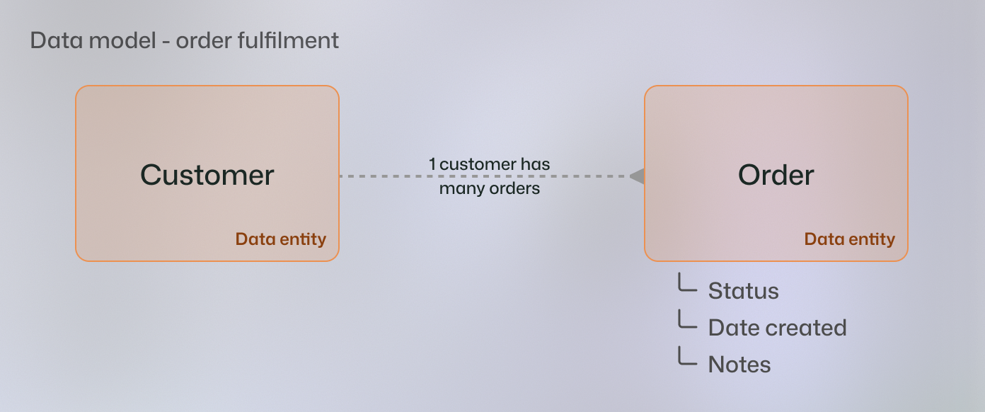
As a worked example, consider a simple order fulfilment workflow
Orders arrive from customers and must be reviewed. A reviewer accepts or rejects the order. Accepted orders move to a fulfilment team, who complete the work and mark the order as fulfilled.
At the domain level this involves two entities:
Next we describe how users need to interact with those entities.
Orders are first reviewed, then fulfilled.
We map the displays and actions we need and the order we need them in to complete the task. The “Primary” actions show the expected, most common or suggested path, a common SaaS pattern. “Secondary” actions provide alternative, optional or supporting paths.
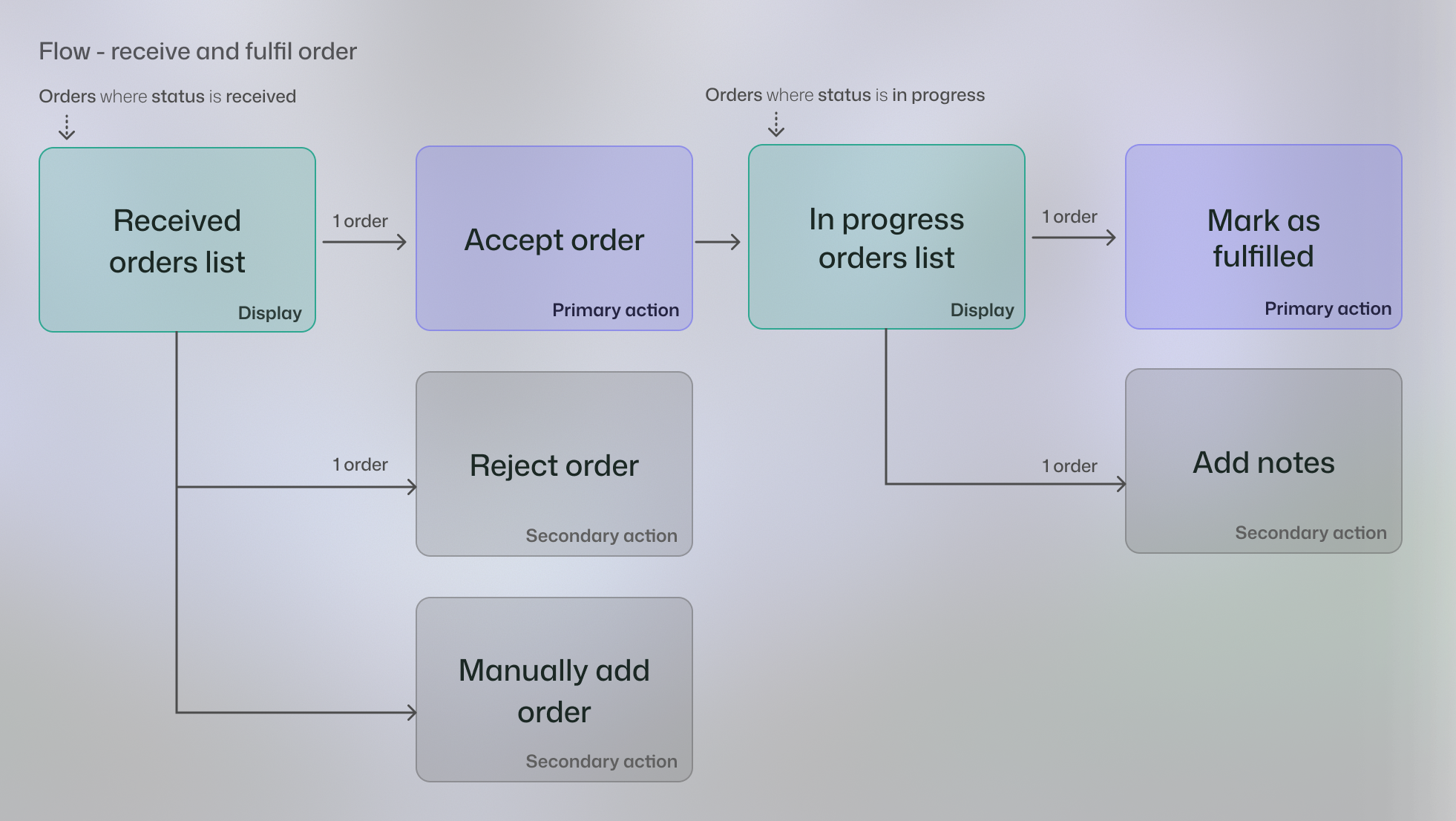
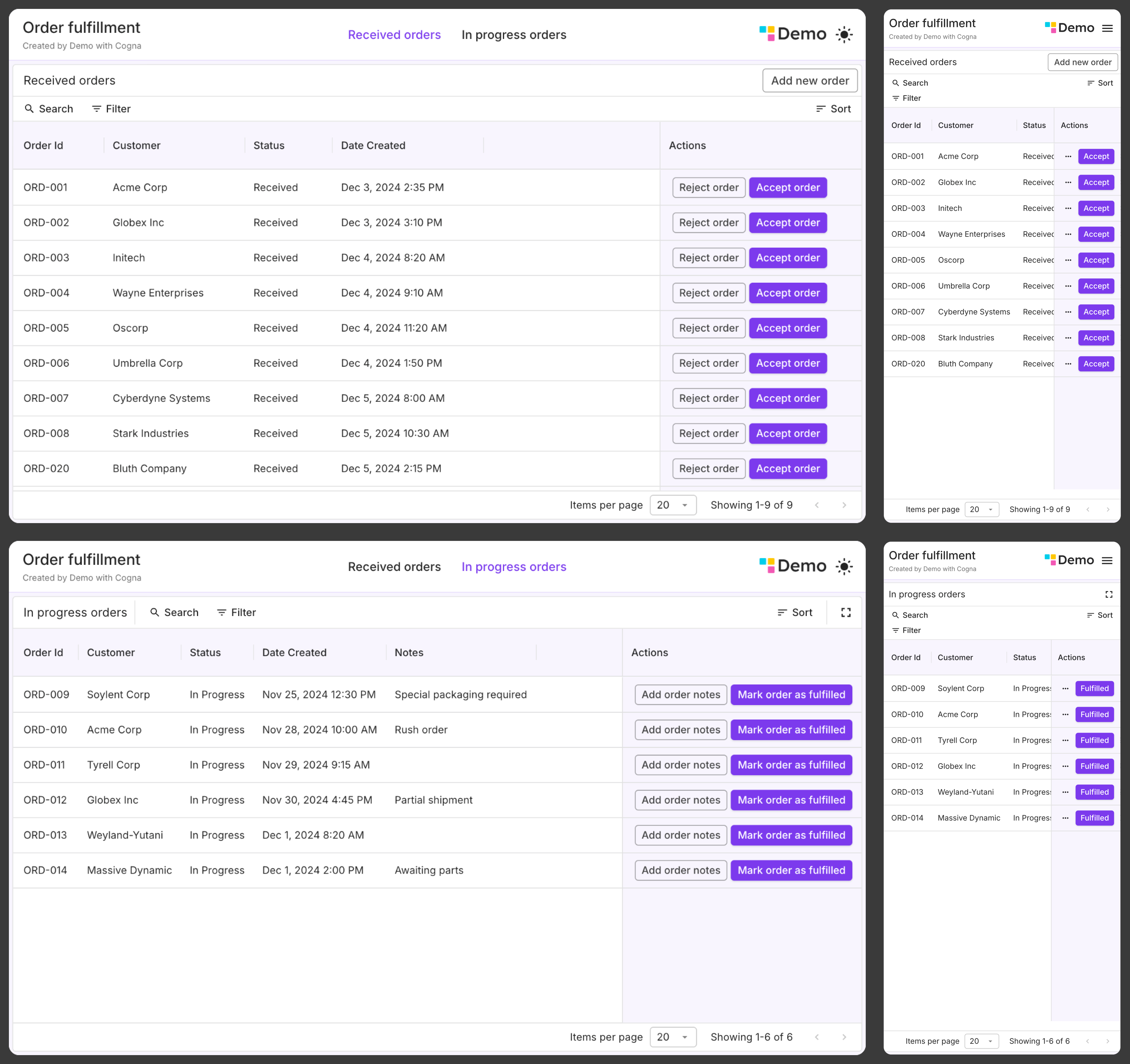
From this structure the renderer produces the UI.
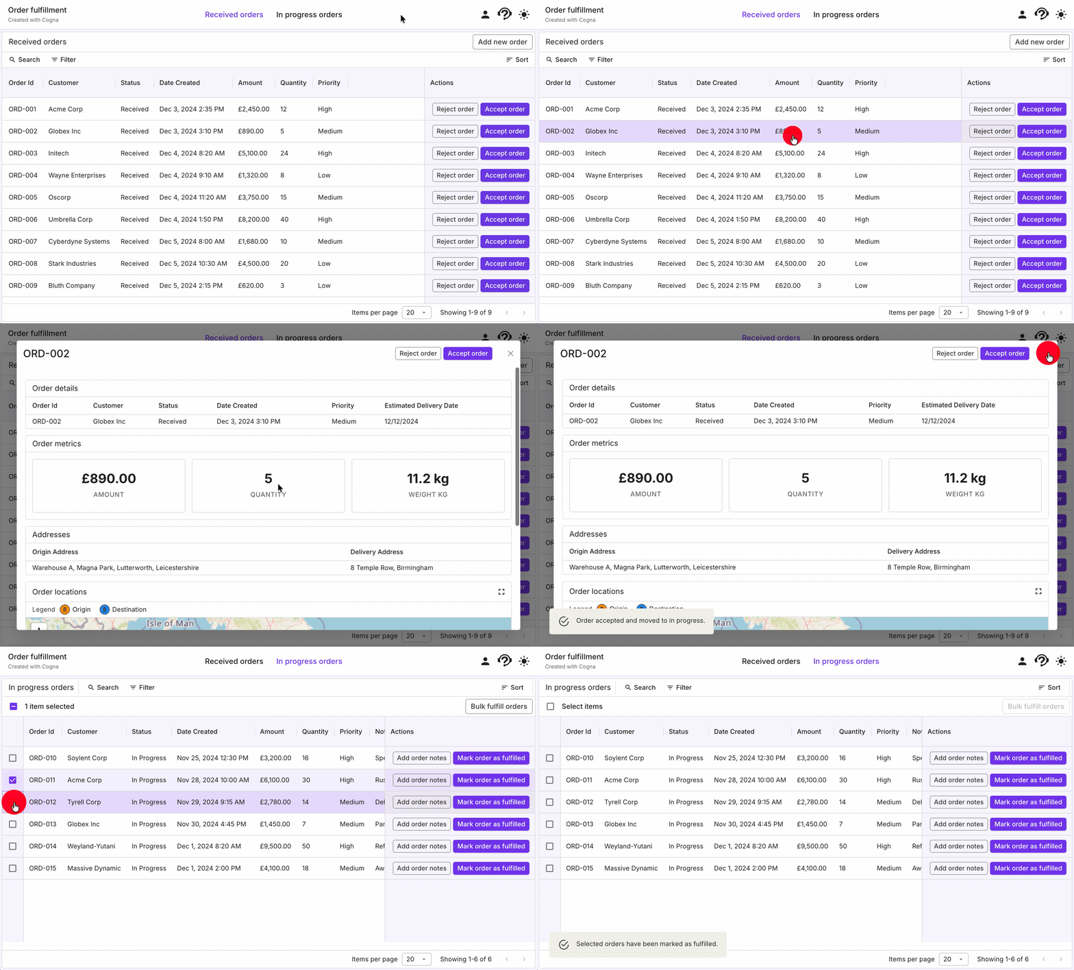
In this case, a simple pair of tables, with action buttons placed at the correct position in the hierarchy meets the user need.
As we add additional items to our flow, the UI changes in a predictable way. We uncover that the desired process requires deeper inspection of order details to assess acceptance and the fulfilment team prefer to fulfil orders in batches rather than one at a time.
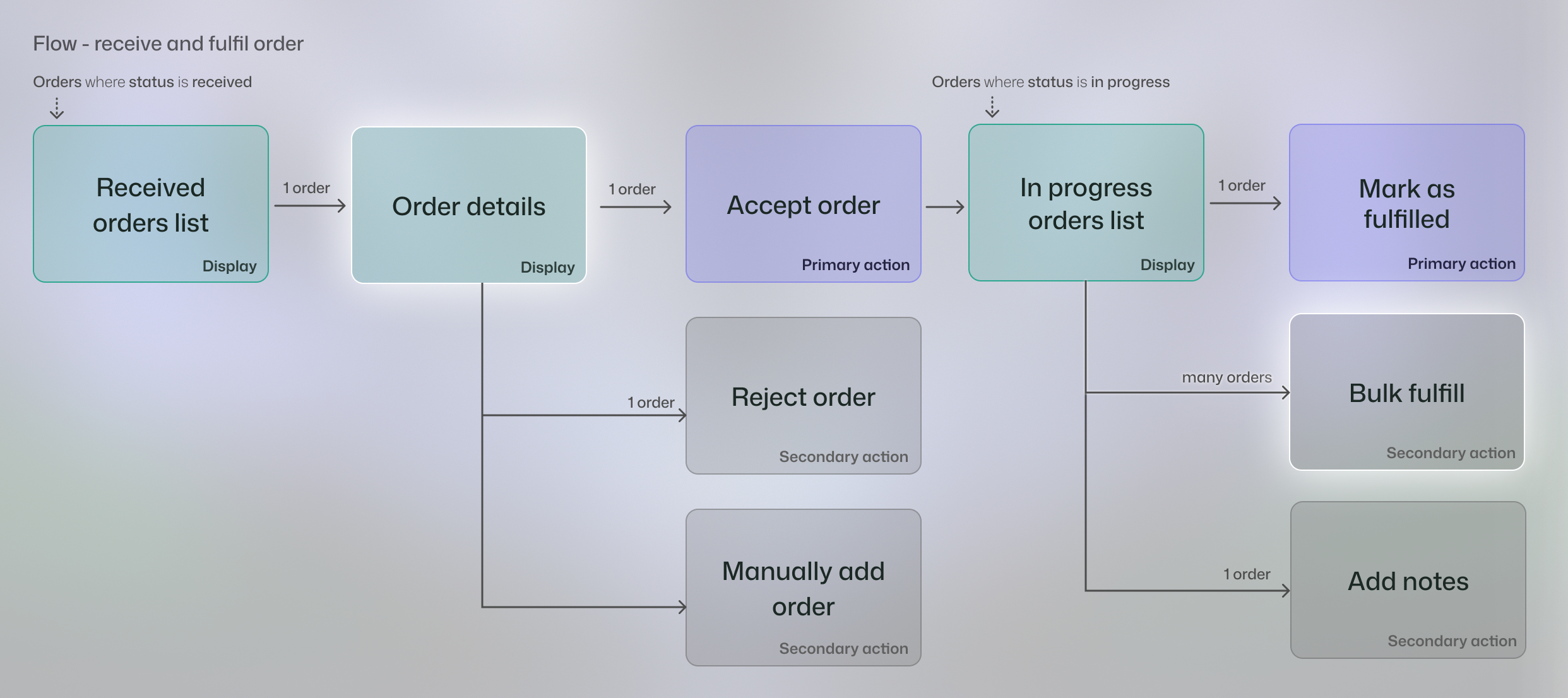
This UI this gives us a pop up for each order to view more details and a multi select to bulk fulfil orders.
We stress-tested the approach further by re-creating known consumer apps, asking non-product team members to create apps in it, and prompting LLMs to generate into the model to evaluate its familiarity.
By late 2024, we had enough evidence to move toward production:
- UI drift reduced because the same structures rendered the same way.
- Intent became explicit rather than implicit.
- Repeated implementations were replaced with shared patterns.
The three problems we started with, inconsistency, duplication, and implicit intent, appeared solvable at the system level.
8. The rollout - from prototype to production
In early 2025, we moved from prototype to production.
We turned the JSON prototype into a formal DSL, the Cogna Design Language (CDL). LLMs generate CDL, and a production renderer transforms it into a working app using a centrally maintained component set.
We shipped the first version on Valentine’s Day 2025.
From then on, all new apps were built on the system. CDL and it’s renderer became the default path from intent to UI.
Since then, it has powered a wide range of applications for critical industries, from evaluating environmental risks of excavation and managing energy network incidents, to optimising food production and modelling logistics latency.
9. What we learned - structure scales, but context matters
At the start of this work we made two key hypotheses.
First, that application intent could be encoded in a structured language.
Second, that this structure could map deterministically to UI.
In practice, the first held up strongly. The second worked within limits, but began to break down as the problem space expanded.
Encoding intent worked
The most important shift was that the system and the people started speaking the same language.
The design language became a shared contract across front end, back end, and data pipelines, and between customers, solution strategists, designers, engineers, and crucially the LLMs generating the apps. Everyone, and everything, reasoned in terms of the same entities, displays, and actions.
That alignment changed conversations. Solution strategists focused on intent. Structure emerged earlier in the process. Design reviewed behaviour at the right level. Fewer debates about layout. More clarity about what the app should do.
It also changed the architecture. Instead of bespoke pages, apps became compositions of shared building blocks. Patterns were implemented once and reused.
As a result, apps started to feel coherent. Interaction patterns repeated. Layout decisions were consistent. Not because someone policed them, but because the structure produced them.
For users, that predictability reduces friction. For the platform, it reduces duplication.
Deterministic UI mapping reached its limits
The deterministic UI mapping worked best when the app stayed inside a relatively narrow SaaS shape, the types of apps we were used to building in our early experimentation phase.
As we expanded to new customers and tackled deeper problems within existing ones, our ambitions grew. The framework began to feel tighter.
To support more complex scenarios, we introduced additional patterns and rules into the renderer. That gradually added complexity back into the system. More branches. More exceptions. The simplification we had worked hard to achieve started to erode at the edges.
At the same time, our idea of what it means to be “opinionated” began to shift.
In the first version, being opinionated meant encoding a strong, deterministic mapping from process to interface. If two workflows looked similar, they would render in the same way. That clarity was powerful.
But as the space expanded, we realised something important: opinion does not mean uniformity.
We had been designing for consistency: the same rules applied everywhere, producing identical outputs. What we actually needed was coherence: apps that feel intentional, not identical.
I often return to an architect analogy: a good architecture firm is opinionated, but it does not design the same building twice.
As a client of an architect, you do not arrive expected to specify every material, structural system, or supplier. The architect brings expertise and strong preferences that guide the design. They work from patterns they trust and standards they know produce quality outcomes.
An architect can design five completely different buildings that are all best in class. The design adapts to the site, inhabitants, climate, building regulations, budget, etc.
If they are building in the arctic circle, they may choose triple-glazed insulated window frames from a supplier they have never worked with before because the conditions demand it. There is sufficient flexibility built into the process that they are able to do this.
Well designed software should behave similarly.
Two users can follow a similar underlying process and need different interface shapes.
A compliance analyst in an office may want dense information, advanced filtering, and audit history always visible.
An engineer in freezing conditions, wearing thick gloves, may need action buttons five times the size.
Similar process. Different context.
A purely deterministic mapping assumes one canonical UI per workflow. That works within limits. Beyond those limits, it becomes restrictive.
What we learned is that structure alone cannot capture the full nuance of real-world use cases.
High-level abstractions are powerful for describing common patterns, but the world is messy. Different environments, users, constraints, and goals introduce variations that cannot always be encoded cleanly in advance.
As the space expands, those edge cases stop being edges. They become the work.
Structure still provides the foundation. It gives us shared concepts, reusable patterns, and a way to reason about applications at scale.
But designing good software ultimately requires judgement. The system needs room to interpret context, adapt patterns, and handle the complexity that abstractions inevitably miss.
10. Where we are going in 2026
The system we built changed how we think about apps.
A structured way to describe what an app does and how data is shaped remains foundational. Shared patterns and reusable components form the base of the system. Consistency, accessibility, and responsive behaviour are handled at the platform level.
What is shifting is where opinion lives.
In the first version of the system, opinion was embedded directly into the deterministic mapping from structure to UI. The rules were fixed. Given a particular description of intent, the interface followed predictably.
As the range of problems expanded, we saw that opinion does not always belong in a rigid rendering layer. It needs to operate at the level of judgement.
Being “opinionated” does not mean every workflow maps to one canonical interface. It means having strong standards about clarity, usability, and quality, while allowing the presentation to adapt to context.
The core concepts remain: entities, actions, displays, structured intent. The shared component foundation remains. What changes is how decisions are made about how those pieces come together.
Instead of trying to encode every design decision into fixed mappings, we are moving toward systems where reasoning plays a larger role. We’re also making room for strategic human judgement, with designers embedded in the process and supported by strong platform patterns, tooling, and context to apply taste and trade-offs where it matters most. Structured intent, shared components, and strong design patterns provide the foundation, but the system has room to interpret context and adapt.
As models become more capable, this means treating them less like configuration engines and more like collaborators operating within a strong design system.
Less consistency. More coherence. Less hard-coded mapping. More structured judgement.
If tackling hard problems and building systems like this excites you, we’re hiring and would love to hear from you!
Ben Graves is a product designer at Cogna with a background in computer science and early experience as a software engineer. His work spans design, engineering, and product strategy, bringing a practical, cross-disciplinary approach to building software.
He’s particularly interested in how AI is making it easier to work across these boundaries. Rather than sticking to rigid roles, he sees these disciplines coming together into a more fluid, creative practice built on shared thinking.